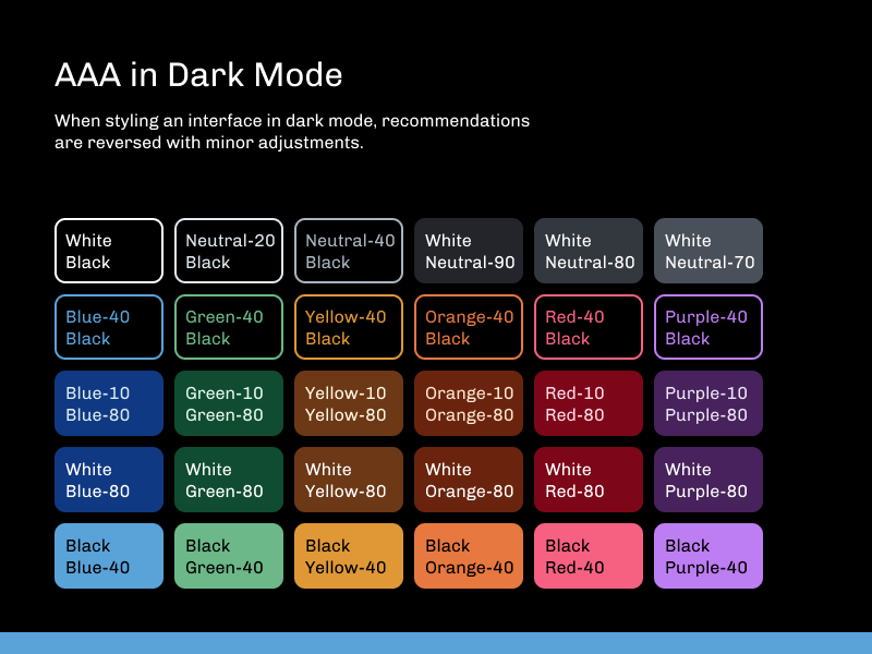
Website titled “Oxygen”, open to the tab about Accessibility:
“Overview
Accela has a responsibility to serve all our customers, regardless of disability or limitation. That’s why we are committed to inclusive, universal design, and to providing accessible interfaces across our products. All Oxygen components follow the standards laid out by the Americans with Disabilities Act and Section 508 of the Rehabilitation Act of 1973, and exceed the Web Content Accessibility Guidelines’s AA rating. Understanding and utilizing these best practices helps ensure the best experiences for everyone.
For developers: Please see our specific a11y developer guidelines on our For Developers page.
Because accessibility is a foundational principle, the following sections address it explicitly, but specifics about how to design and build accessible experiences are organized with related guidelines, most notably in Color, Content, Interaction and Development.
Universal Design & Disability
Our goal for accessibility at Accela is to think about the experience of the audience first when making design decisions, and to include the entire spectrum of human ability when picturing that audience. We know that everyone could benefit from a little extra help from time to time, so rather than providing an alternate experience, our designs have compliance baked into the foundation.
Permanent Disabilities include loss of vision, hearing, motor control, cognitive…”

A grid of color swatches, showing 9 shades in 7 hues each.

“AAA Color Combinations: The following color combinations provide AAA contrast ratios and should be the go-to for textual interfaces,” followed by a grid of color swatches, indicating what color text to use on top of various backgrounds.

“AAA in Dark Mode: When styling an interface in dark mode, recommendations are reversed with minor adjustments,” followed by a grid of color swatches, indicating what color text to use on top of various backgrounds.

An 11 by 11 grid of color swatches, showing the color contrast ranges that are acceptable for AA and AAA compliance in Spectrum’s neutral ramp.

“Icon Grid: To make icons fairly cohesive, every icon in each size has been drawn using the same grid and keylines. This helps ensure that different icons feel the same size and weight, and that each icon can be interchanged with others without problems.
Our icons are designed on two grid sizes: 20pt for small icons, and 24pt for the standard set. Each includes a built-in 2pt minimum trim area on all sides. This makes each icon occupy about 60% of its own tap minimum target, granting a generous margin of error.
For each size there are four keylines: a circle, a square, and two orientations of rectange,” followed by an example of each keyline in use: a circular clock, a square website, a tall rectangular document, and a wide rectangular envelope.

“Display Sizes: The 20pt icons should be used sparingly, only as part of a larger component such as a table, where the standard size will not comfortably fit. They should also not be scaled up or down at any time.
The 24pt icons can be used more liberally throughout the interface, within buttons and menus and to indicate record types, statuses, sections and more. They should never be scaled down, though the following intervals are appropriate for scaling up:
36pt, 48pt, 60pt, 72pt, and any greater multiple of 24,” followed by examples of the house icon at sizes from 20 to 120 pt.

“Icon Details: Accelicons are drawn with a small set of visual motifs and principles in mind.
Align to the keylines
Align to the pixel grid
Stay within the live area
Use 2pt stroke weight
Have rounded exterior corners
Have sharp interior corners
Have flat stroke terminals
Portray objects in 2D
Reuse components when possible
Provide inclusive variants
Individual icons may require some bending of the rules, such as using 1.5pt stroke in a particularly complex icon, straying slightly from a keyline, or using a sharp exterior corner or rounded stroke terminal. These optical adjustments and minor liberties are acceptable provided that they best serve the icon’s meaning.”

“Internationalization: Many icons will be appropriate across international uses by default, but in some cases there are multiple variants for different regions, particularly those showing a globe or currency symbol. In these instances, the icon should be prepared for a swap during localization,” followed by variations in icon showing currencies and parts of the earth.

“Right to Left: Some icons indicate or rely on direction in a way that will be incompatible with right-to-left implementations. For these icons, be prepared to programmatically mirror or replace the image,” followed by a variety of icons, including arrows, those showing writing, and methods of travel.

“Inclusion: The Accelicon icon set aims to be inclusive in its representation, providing icons for multiple faiths, non-male-default icons for people, and icons to represent various disabilities and assistive technologies,” followed by a variety of examples.

The typographic hierarchy, showing five levels of header, body text and caption styles in Chivo.

“Chivo: This sans serif is friendly yet professional, distinctive yet readable. Accela tested several typefaces for user preference in 2018, and Chivo edged out all the competition, including Open Sans, its predecessor in our interfaces. Chivo is the typeface of choice for most situations,” followed by the main character set of the typeface.

“Callout: Though it features a robust character set, Callout should only be used to draw attention to important numeric values, such as dates, times and scores. Use sparingly and deliberately, and check OpenType features for variant glyphs. Avoid using it at sizes smaller than 20pt, and use the smallcaps / lowercase only in conjunction with full height characters, as in McElroy or 9:00pm,” followed by the main character set of the typeface.

“The Oxygen Design System includes five button roles:
Primary, for the main action of a page
Secondary, for other actions
Create, for creating, adding or uploading
Delete, for deleting or canceling
Tertiary, for de-emphasized actions appearing next to another button
For all buttons, the following content standards apply:
Use the button text to describe the action that clicking the button will take in the imperative mood, as in: Search, or Edit Record
Limit button copy to one or two words, usually Action + Direct Object
Use the button icon to reinforce the verb portion of the action
Do not customize the icon to relate to the object
Do not “grey out” unavailable buttons, but instead use the rejection state with relevant feedback”

Design previews for 15 varieties of button.

“The Oxygen Design System includes many specialized form fields which should be utilized to constraint input whenever possible, with inline or on-submit validation available for special cases.”

A design preview for 10 varieties of inputs.


